
Louise’s TOP TIPS for Pastel Drawing
Use good quality toothed paper with texture to ensure the best result (such as Colourfix). Smoother paper has it’s uses but be aware you won’t be able to do as much layering as you can on textured paper. You can also buy Colourfix in a jar and paint it on a suitable surface (such as matt board or watercolour paper) to create a textured surface for your pastel artwork.
Consider your subject, composition and the colour of paper that will suit. Some pastel papers come in a wide range of colours and tones. I tend to favour white or light tones (especially for beginners) as I feel it gives a ‘fresher’ look. It’s very much about your subject, experimenting and personal choice.
You can use fluids such as water, alcohol and even an acrylic matte medium with pastels if you have a surface that can handle liquid. I don’t recommend this for beginners, try experimenting first on scrap paper! It works similarly to water colour. It can be useful for doing an ‘under wash’. You can also under paint in acrylic paints and use this as a surface for your pastel artwork.
Pastels come in several different forms. Here we are discussing soft and hard pastels. Note though, that although widely referred to as ‘chalk’ pastels, most of the good artist quality pastels do not have any chalk in them. These pastels are basically made from pigment and a small amount of binder such as gum arabic. Soft pastels have less binding agent in than hard pastels.
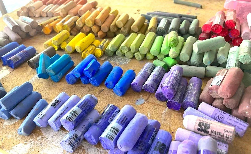
Select your colour palette depending on your subject, being sure to have a good spread of dark, medium and light values. If you’re not sure where a particular colour sits on the value scale, take a photo of your selected palette and then convert to black and white; this makes it easy to see the values of all the pastels you have selected.
When using both hard and soft pastels together, you can use the hard pastels first to under draw and then the soft pastels on top. The hard pastels can also be handy for putting in thin lines and fine detail.
Charcoal can be useful in some compositions but use cautiously or you can ‘muddy’ your artwork.
Use the edge of the end of a pastel stick to create defined, clean lines. Vary the thickness by applying more or less pressure. If you roll and vary the pressure you can create interesting, painterly lines.
Use the side of your stick to cover larger areas quickly. You can also add twists to create ‘energetic’ ribbon type marks.
A dry paint brush is handy to have available as it can be used like an eraser to remove pastel from the paper. It is harder to remove blended colour that has been pushed into the paper. In this case brush off the excess, then use a kneaded rubber to remove the rest.
One of the most important tips is to avoid over blending. This is the biggest rookie mistake and will make your work look dull, muted and bland. Blending is awesome but should only be used in limitation. For instance, for a blue sky your first layer might be a really bright blue followed by some white over the top which you then blend to tone it down and to graduate lighter (ie getting lighter as it gets towards the horizon). Be sure that your piece has plenty of ‘marks’ that have not been blended as you build up the layers. In my workshops, I demonstrate techniques that will help you achieve this.
I am often asked if I use a fixative to seal my pastels artworks when finished. I don’t as such as it tends to darken the work. However, occasionally I use fixative in a selected area along the way to darken that area if that’s the effect I’m after and/or extend application (ie applying fixative can give more tooth so extra layering can be applied).
There are a few points to consider when framing your pastels artwork and a bit too much information to cover here. I talk about this in my workshops.
PASTEL COLOUR CHOICE MADE SIMPLE:
If you pop into an art shop to choose some soft pastels, you can be forgiven for being overwhelmed. It seems like there are so many colours! However, there aren’t as many pigments as you would think because each pigment has several versions of itself. Some of the Art Spectrum pigments come in six versions of varying values that pertain to the legend below:
D = DARKEST
N = DARK (Nero)
P = PURE PIGMENT*
T = TINTED
V = VERY TINTED
X = EXTRA TINTED
*Note in the above legend ‘P’ is the pure pigment (neither Black or White added).
The pigment itself will have a name/number (eg in the Art Spectrum Range, Flinders Red Violet is 517). There are six versions of this – 517D (the darkest version, black has been added); 517N (a smaller amount of black has been added); 517P = the pure pigment; 517T is a lighter (tinted with white) version of the pure pigment; 517V is lighter as it has more white added and 517X is the lighter again.
If you found Louise’s Top Tips for Pastel Drawing useful, why not consider coming to one of Louise’s Pastel Workshops where you will learn a number of techniques including:
Blending
Scumbling
Hatching & Cross Hatching
Feathering
Dusting
Broken & Pointillism
Using different parts of your pastel stick and applying different pressure and techniques to create a variety of mark marking.
Framing pastel artworks.
Plus heaps more tips, techniques and a live demonstration before you create your own soft pastel artwork.
See all our upcoming workshops on our events page.
Subscribe to our Mailing List and be the first to know about our upcoming Art Outdoors Events.
